Recently, I took over a frontend project that uses Less and CSS modules for styling. Here I’ll organize and summarize these approaches.

Before showing the actual code, it’s necessary to understand the background of both technologies.
What is Less?
We know that the three essential elements of frontend development are CSS, HTML, and JavaScript. CSS handles styling, HTML handles content, and JS controls interaction. This is fundamental.
But we also know that CSS is too rigid—you could say it only deals with static values. We’re used to object-oriented programming and formulas, and even for CSS, we want to follow the DRY principle. So, can we enhance CSS? That’s where LESS comes in.
Less (which stands for Leaner Style Sheets) is a backwards-compatible language extension for CSS. This is the official documentation for Less, the language and Less.js, the JavaScript tool that converts your Less styles to CSS styles.
In short, LESS is a CSS preprocessor. Besides LESS, there’s also SCSS, but they’re quite similar. In the end, I decided to use LESS in the current project.
There are two reasons:
- For our UI component library, we chose Antd, which uses LESS. Maintaining consistency with it helps us better control the overall UI.
- In terms of syntax, I’m more used to Less.
Advantages of Less
The advantages of Less address the pain points of CSS itself. As mentioned above, using Less allows us to better reuse CSS through variables, formulas, etc.
What are CSS Modules?
A CSS Module is a CSS file in which all class names and animation names are scoped locally by default. All URLs (url(…)) and @imports are in module request format (./xxx and ../xxx means relative, xxx and xxx/yyy means in modules folder, i. e. in node_modules).
In a nutshell, a CSS module is a CSS file where all class names and animation names have their own scope.
A Brief Mention of My Previous Frontend Project
Let me talk about my previous project. We used Less but not CSS modules. There was no distinction between local and global scopes for styles, and the naming conventions were all over the place. The serious consequence was that we had many !important declarations and a lot of “robbing Peter to pay Paul” fixes. The styles weren’t well-planned or designed, with zero reusability. From a pessimistic view, I’d say the maintainability was also zero.
How to solve this? After much reflection, I decided to use CSS Modules.
The Code
Project Technical Background
- TypeScript
~3.3.1 - React
16.4.2 - Webpack
4.17.1
Now that we understand the background, let’s start.
typings.d.ts
To support Less as a module import in TS components, we need to make a declaration:
typings.d.ts
declare module '*.less';
Webpack.js
We need to add corresponding rules in webpack:
{
        test: /\.less$/,
        use: [
          require.resolve('style-loader'),
          {
            loader: require.resolve('css-loader'),
            options: {
              importLoaders: 1,
              localsConvention: 'camelCase',
              modules: {
                mode: 'local',
                localIdentName: '[name]-[local]-[hash:base64:5]'
              },
              sourceMap: options.env !== 'production'
            }
          },
          {
            loader: require.resolve('less-loader'),
            options: {
              javascriptEnabled: true,
              sourceMap: options.env !== 'production'
            }
          }
        ]
      }
A few things to note:
- The sourceMap configuration is for easy debugging of Less in the development environment.
- CSS module is enabled in css-loader, not less-loader.
- For the naming convention in localIdentName, I used kebab-case (though snake_case would also work).
Writing Styles in React Projects
Local
footer.less
.footer {
  background-color: rgb(0, 0, 0);
  color: #999999;
  padding: 49px 155px 70px;
  font-size: 14px;
  letter-spacing: 0;
  text-align: left;
  line-height: 18px;
  }
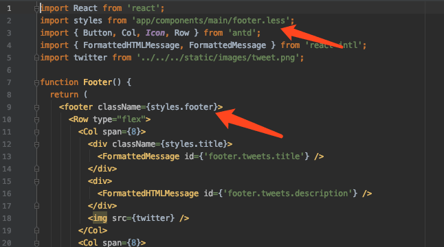
Final Effect

Note:
- If you use kebab-case in Less, like .footer-bg, it will still be camelCase in the component (footerBg)
- I personally recommend using camelCase for CSS modular styles to ensure consistency between components and Less files. For non-modular styles (those we want to be global), use kebab-case to distinguish between the two.
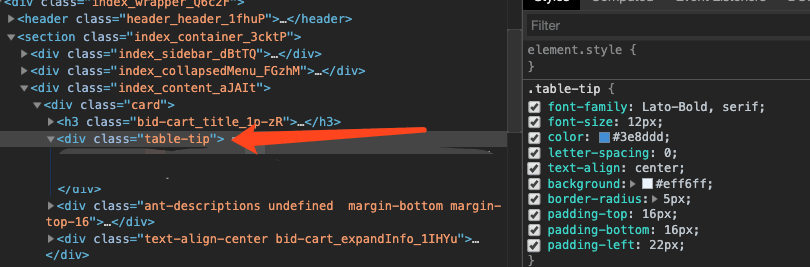
Global
To write global styles, just add the :global selector. After specifying the global scope with :global, the compilation won’t add hash fingerprints.
:global {
  .table-tip {
    font-family: @font-bold;
    font-size: 12px;
    color: @blue;
    letter-spacing: 0;
    text-align: center;
    background: @light-blue;
    border-radius: 5px;
    padding-top: 16px;
    padding-bottom: 16px;
    padding-left: 22px;
Global styles can be used normally in all components, simply by using className directly:
<div className="table-tip">
            <FormattedMessage id={'tip'} />
          </div>
Final Effect
Overall Style Planning and Design
With Less and CSS modules in place, I did some planning and design for the project’s overall style.
Theme
In the app project, I created a separate folder called theme:
.
├── antd.less
├── company.less
└── theme.less
- antd.less is used to rewrite default styles, like button colors, form sizes and spacing, etc.
- theme.less defines font variables, the website’s basic color scheme, etc.
- company.less exists because I considered extracting common styles into a company-wide unified UI style during project development. Since multiple company projects follow a unified style, extracting this makes sense. By syncing the entire theme folder in the future, we’d have the basic UI ready. It’s about DRY. If you’re not concerned with reusing project styles, this file can be removed.
app.less
This is used to define global styles and also imports the antd styles from the theme folder, overriding default styles when loading. It also imports theme variables.
component.less
With global styles and a series of global variables defined, individual components only need to create their own customized styles as needed. For common values like fonts and colors, they can simply import theme.less.
Style Modularization in Angular
Since I’ve worked with Angular 2 before, which is a framework with a complete set of solutions, let’s briefly discuss how it handles style modularization.
Note: When we talk about Angular here, we're referring to Angular 2 and later versions. The latest version is currently 9.0.0-next.4.
Here’s a component style I wrote and its final parsed result:
home.component.css
h1[class='say hello'] {
    color: red;
}
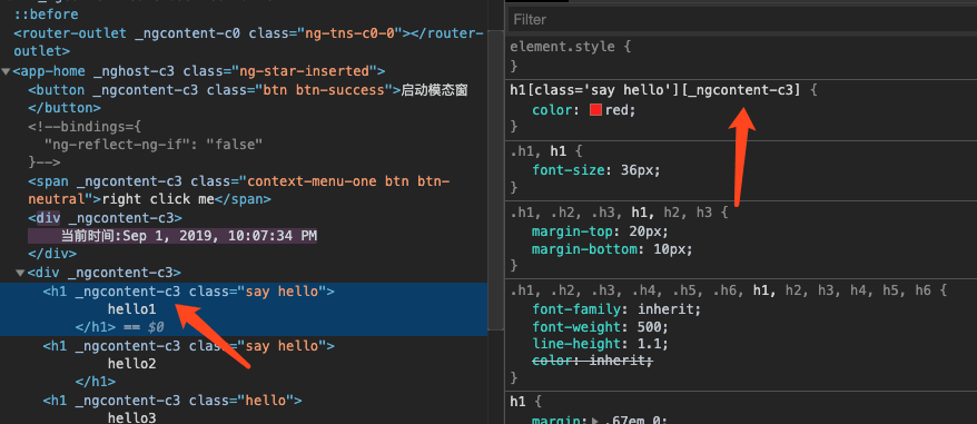
Looking at this, you should understand that it essentially uses CSS attribute selectors to achieve CSS modularization. Comparing it with the class name approach of CSS modules, you’ll find they’re similar in principle.
Conclusion
Even without using CSS Modules, methodologies like BEM could solve the problem. But undeniably, the CSS Modules approach is more elegant. With the setup described above, our styles won’t have unexpected effects or become a mess.
Of course, good tools are one thing, but what’s more important is the team using those tools and forming a unified understanding. So, keep going!

