Recently, when discussing the next development of the project with the PM, we talked about mobile web pages and mobile app planning. During this discussion, we mentioned adaptive layout and responsive layout, but in the communication, I felt that these two terms seemed to be always bundled together, as if in everyone’s eyes adaptive === responsive === one codebase for all platforms.
Right? No, as a developer, I often confuse these two terms. Taking advantage of my relatively free time recently, let me organize this.

Image from here
Adaptive Web Design
- Proposed time: 2010
- Concept: Web design that automatically recognizes screen width and makes corresponding adjustments.
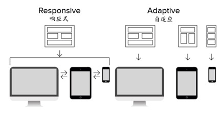
- Implementation technology: Fixed breakpoints for layout
Responsive Web Design
- A subset of adaptive web design
- Concept: All devices use the same set of logic, i.e., the same set of code
- Implementation technology mainly uses CSS media queries to adjust layout for different device types and sizes. Sometimes it also needs some JavaScript assistance, like menus.
Responsive layout has higher cost compared to adaptive because there are various device types and device resolutions.

