Today a friend asked me what the gray bar chart in Apple’s Screen Time statistics means. I actually wasn’t too sure either, so I looked it up and here I’ll record what I found.
Gray Bar Chart
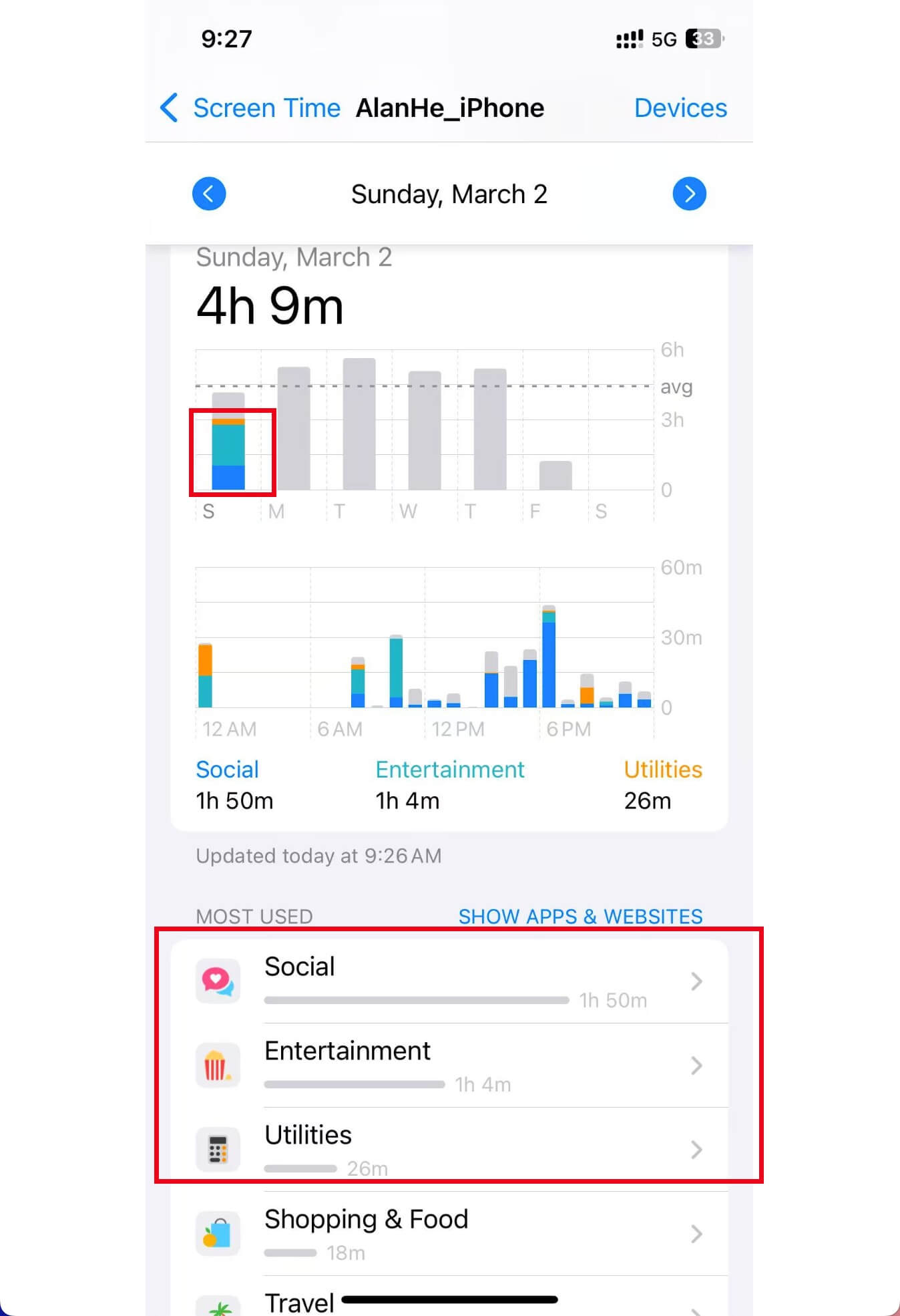
After actual research and analysis, here’s my personal understanding. The gray bar chart represents the time you use apps, but this time is not your actual app usage time, but rather the time Apple estimates based on your app usage patterns.